top of page

hôntô
Brand Identity, Packaging, Art Direction
Brand identity for a hidden Japanese dining room in Brisbane’s Fortitude Valley, built around contrast, restraint and a quiet sense of discovery.


“
“
The visual language begins with the room itself. Blackened timber became more than a backdrop. Its depth, grain and shadow informed the identity’s monochrome palette, restrained typography and textural applications across print and packaging.
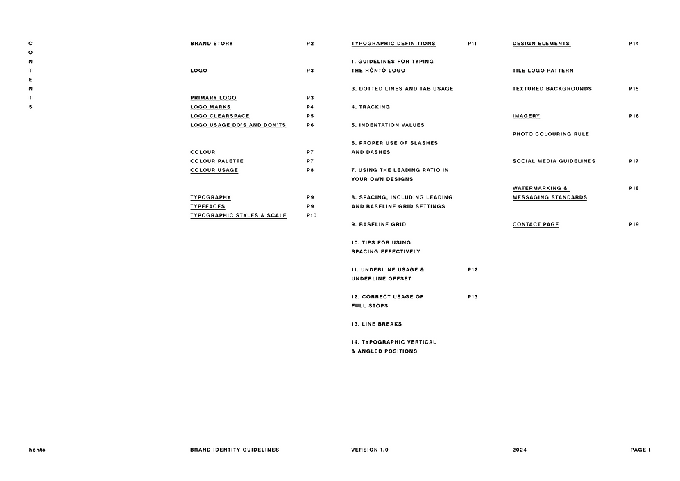
At the centre of the identity is a custom wordmark shaped by clarity and proportion. The circumflex accents become the defining gesture of the brand. They give the name its rhythm, while allowing the system to reduce and extend — from the full hôntô wordmark to the ôô bar identity.


“

“
The ôô mark became a pattern language of its own, creating rhythm and depth across print, packaging, table collateral and spatial details while staying closely tied to the logo. Menus, coasters and bar pieces were designed with precise typesetting, generous spacing and restrained pattern work, allowing the system to feel considered, functional and quietly detailed. For the hôntô bar, the ô mark extended into select merch, including a subtle sushi motif on the hat that added a measured sense of play without drifting from the core identity.
“


“
“
The identity takes its cues from the room itself. Blackened timber, low light and white typography create a simple visual tension. Rather than adding decoration, the brand system extends the material language of the restaurant across every touchpoint.

“


“
“
“
For social, the identity shifts through motion. Simple typographic animations and pattern-based movement bring pace to the system while preserving its restraint. The digital expression remains direct, atmospheric and closely tied to the physical brand.

“
“
The merchandise range gives the identity a more casual expression. Caps, apparel and selected items use the ôô mark with subtle shifts in scale and placement. The result feels relaxed but still aligned — a quiet extension of the hôntô world.


Sector
Hospitality
Location
Brisbane
Year
2017
Brand identity for a hidden dining room in Brisbane’s Fortitude Valley.
hôntô is built around contrast, restraint and a sense of discovery. The identity draws from the deep, charred texture of shou sugi ban, shaping a monochrome system that feels quiet, tactile and precise.
Across logo, print, pattern, packaging and motion, each element was designed to sit within the atmosphere of the restaurant — not above it.
Selected photography: Victoria Cranstoun, Callie Marshall
bottom of page